17 Tableau Alternatives Picked for 2026

Tableau Alternatives Shortlist


A strong Tableau alternative gives your team flexible analytics, intuitive data visualization, and integration with your existing data sources—without locking you into a single vendor’s ecosystem. If you’re searching for the best Tableau alternatives, you’re likely weighing cost, deployment options, and how well each tool fits your analytics workflows.
This list will help you compare leading options, so you can confidently choose a solution that matches your business’s reporting needs, technical requirements, and growth plans.
What is Tableau?
Tableau is analytics software that lets you visualize, analyze, and share data through interactive dashboards and reports. Teams use Tableau to connect to multiple data sources, explore trends, and present insights in a visual format.
Its drag-and-drop interface and wide range of integrations make it popular for business intelligence, reporting, and data-driven decision-making across retail, ecommerce, and other industries.
Best Tableau Alternatives Summary
This comparison chart summarizes pricing details for my top Tableau alternatives to help you find the best option for your budget and business needs.
| Tool | Best For | Trial Info | Price | ||
|---|---|---|---|---|---|
| 1 | Best for tracking website visitor behavior | Free plan available | Pricing upon request | Website | |
| 2 | Best for product usage cohort analysis | Free plan + free demo available | From $1200/year (billed annually) | Website | |
| 3 | Best for embedded analytics in applications | 7-day free trial + free demo available | Pricing upon request | Website | |
| 4 | Best for automatic event data capture | Free plan + free trial + free demo available | Pricing upon request | Website | |
| 5 | Best for real-time mobile app insights | Free demo available | From $40/month | Website | |
| 6 | Best for self-hosted deployment flexibility | Free plan + free demo available | From $0.00005/event | Website | |
| 7 | Best for privacy-focused reporting | 21-day free trial + free plan available | From $26/month | Website | |
| 8 | Best for Microsoft 365 ecosystem integration | Free plan available | From $14/user/month (billed annually) | Website | |
| 9 | Best for customizable dashboard creation | Free trial available | Pricing upon request | Website | |
| 10 | Best for advanced statistical modeling | Free trial + free demo available | Pricing upon request | Website |
Why Trust Our Software Reviews
We’ve been testing and reviewing retail and ecommerce software and services since 2021.
As retail experts ourselves, we know how critical and difficult it is to make the right decision when selecting software. We invest in deep research to help our audience make better software purchasing decisions.
We’ve tested more than 2,000 tools for different finance and accounting use cases and written over 1,000 comprehensive software reviews. Learn how we stay transparent and our review methodology.
Tableau Alternatives Reviews
Below are my detailed summaries of the Tableau alternatives that made it onto my shortlist. My reviews offer a detailed look at the features, best use cases, and integrations of each platform to help you find the best one for your business.
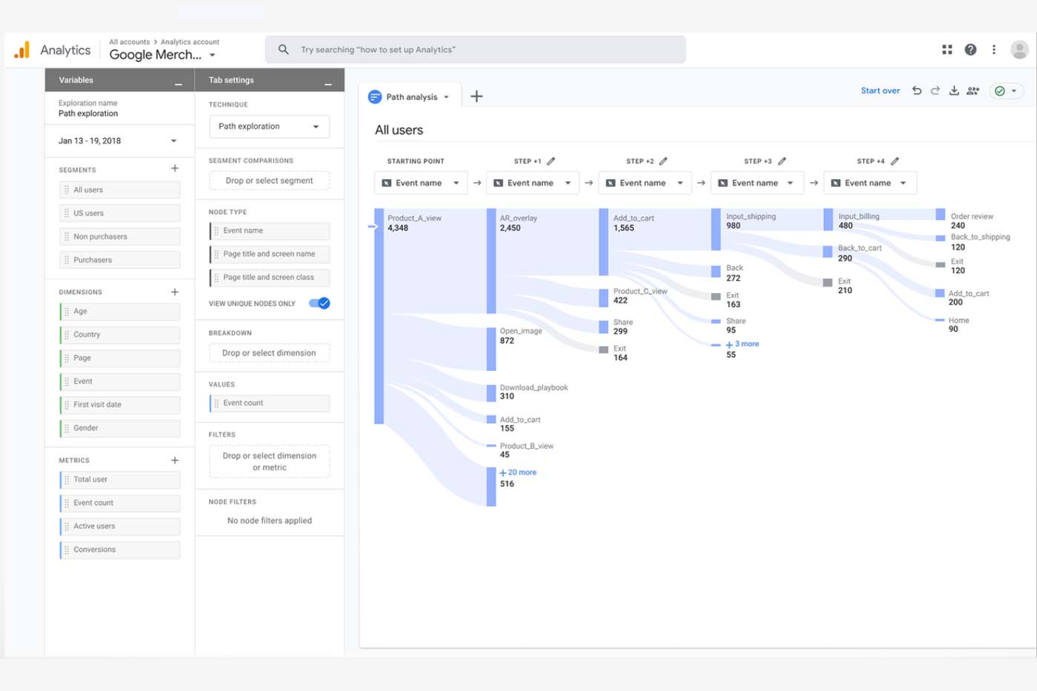
If you need to understand exactly how visitors interact with your website, Google Analytics offers detailed tracking and reporting tools built for digital teams. It’s especially useful for ecommerce, marketing, and content teams who want to analyze user journeys, conversion funnels, and campaign performance. Unlike Tableau, Google Analytics specializes in real-time web data collection and attribution, making it a go-to for optimizing online experiences.
Why Google Analytics Is a Good Tableau Alternative
For teams focused on understanding website visitor behavior, Google Analytics offers specialized tools that Tableau doesn’t provide out of the box. I picked Google Analytics because it tracks real-time user activity, page views, and traffic sources directly from your website. The platform also lets you set up conversion goals and analyze user flows to pinpoint where visitors drop off or convert. If your main priority is optimizing digital experiences and campaigns, Google Analytics delivers the targeted insights you need.
Google Analytics Key Features
Some other features in Google Analytics that digital teams may find valuable include:
- Custom Event Tracking: Set up and monitor specific user actions like downloads, video plays, or form submissions.
- Audience Segmentation: Create and analyze custom audience groups based on demographics, behavior, or acquisition channel.
- Ecommerce Reporting: Track product performance, transaction data, and revenue metrics for online stores.
- Data Studio Integration: Connect with Google Data Studio to build custom reports and visualizations using your analytics data.
Google Analytics Integrations
Integrations include Google Ads, Google Tag Manager, Google Search Console, Google Data Studio, Google Optimize, Google AdSense, Firebase, BigQuery, Display & Video 360, and Search Ads 360.
Pros and Cons
Pros:
- Ease of use for startups and small businesses analyzing web behavior
- Audience segmentation and funnel tracking for marketing performance
- Free cloud platform for website data analysis and traffic insights
Cons:
- Advanced setup and reporting configuration can be time-consuming
- Limited business intelligence tools compared to full BI platforms
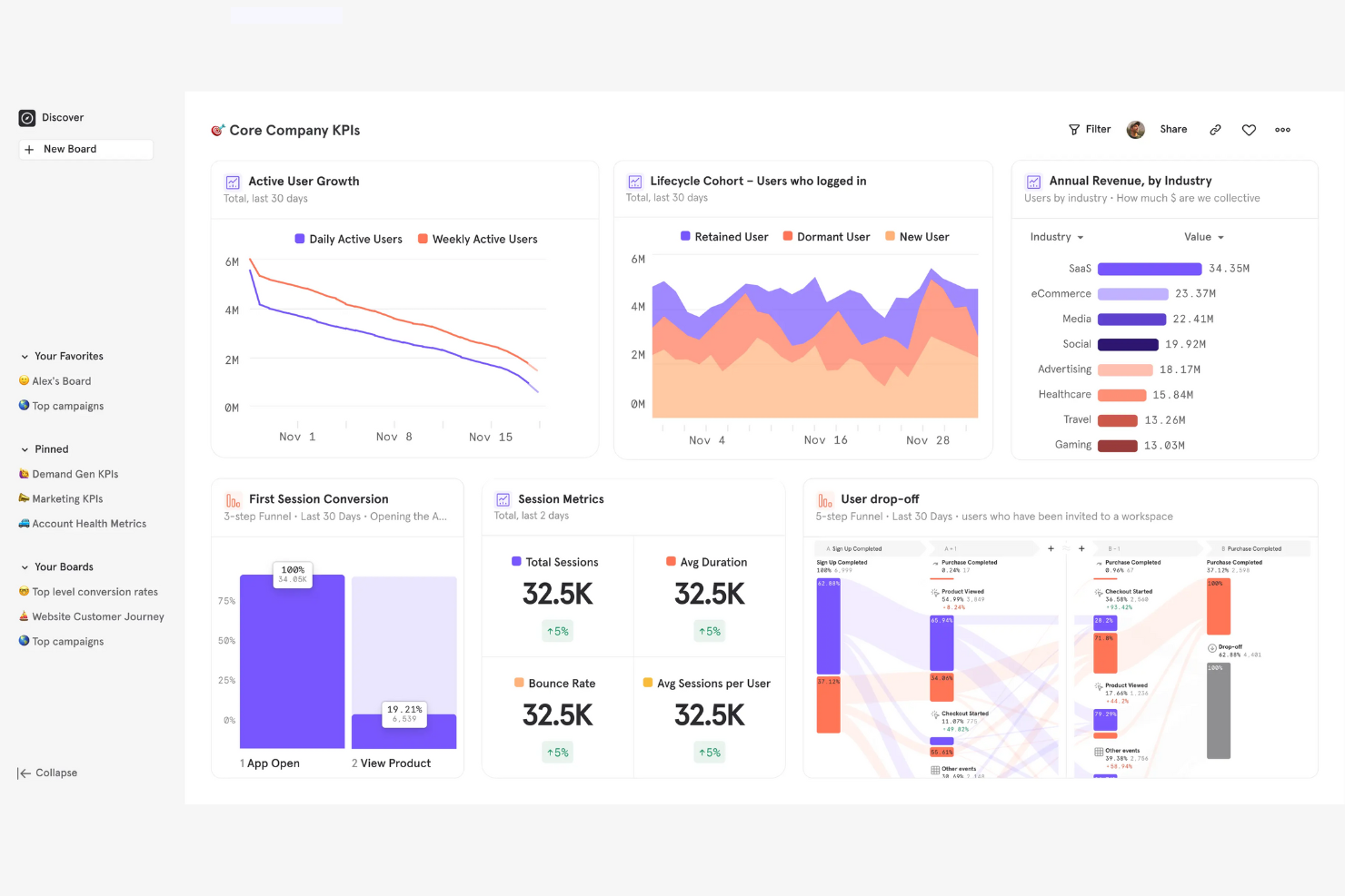
For teams focused on understanding how users interact with digital products, Mixpanel offers a specialized analytics solution. It’s especially useful for product managers, growth teams, and SaaS businesses that need to analyze user cohorts and track feature adoption over time. Unlike Tableau, Mixpanel is built for event-based tracking and makes it easy to segment users by behavior, retention, and engagement patterns.
Why Mixpanel Is a Good Tableau Alternative
Mixpanel takes a different approach from Tableau by focusing on product usage cohort analysis. I picked Mixpanel for teams that need to track how different user groups engage with features over time. Its event-based tracking lets you create detailed cohorts based on user actions, retention, and engagement. Mixpanel also offers funnel analysis and retention reports that help you pinpoint where users drop off or return, making it a strong fit for product and growth teams.
Mixpanel Key Features
Some other Mixpanel features that analytics buyers may want to know about include:
- A/B Test Analysis: Measure and compare the impact of experiments on user behavior.
- Custom Dashboards: Build and share dashboards tailored to your team’s metrics.
- Data Import and Export: Bring in data from other sources and export reports as needed.
- Alerts and Notifications: Set up automated alerts for key metric changes or anomalies.
Mixpanel Integrations
Integrations include Segment, Snowflake, Google BigQuery, Salesforce, HubSpot, Slack, Zapier, Airflow, and Fivetran.
Pros and Cons
Pros:
- Cloud platform designed for startups and SaaS product teams
- Segmentation tools help business users analyze engagement patterns
- Behavioral data analysis with detailed cohort and retention insights
Cons:
- Advanced queries can create a steep learning curve
- Not designed for broad business intelligence reporting
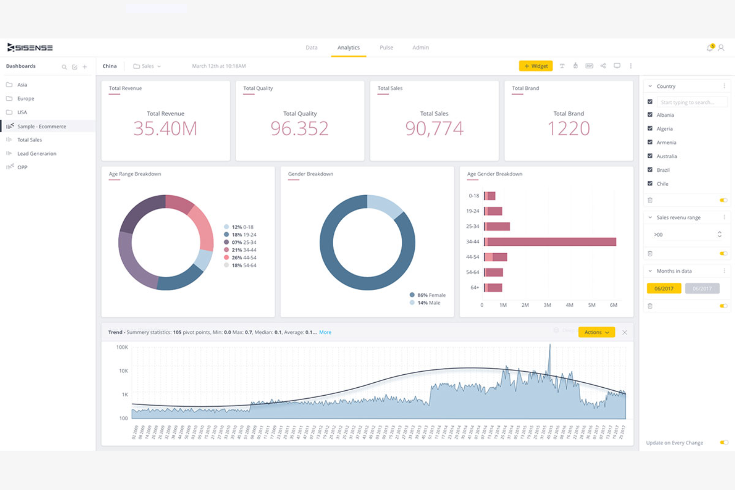
For teams looking to add analytics directly into their own products or portals, Sisense offers a flexible platform for embedded analytics. It’s especially useful for software vendors, ecommerce platforms, and digital product teams that want to give users interactive dashboards and reports inside their own applications. Unlike Tableau, Sisense is built to support deep integration and white-labeling, so you can deliver analytics as part of your branded experience.
Why Sisense Is a Good Tableau Alternative
If you need analytics that live inside your own product or customer portal, Sisense is purpose-built for embedded analytics in applications. I appreciate that Sisense offers a full set of developer tools and APIs, so you can customize dashboards, reports, and visualizations to match your brand and user experience. The platform also supports white-labeling, letting you present analytics as a seamless part of your own software. This makes Sisense a strong Tableau alternative for teams that want to deliver analytics directly to end users within their own environment.
Sisense Key Features
Some other Sisense features that analytics buyers may want to know about include:
- Elastic Data Engine: Process and analyze large volumes of data from multiple sources in real time.
- AI-Driven Analytics: Use built-in AI tools to generate insights and automate data exploration.
- Custom Data Modeling: Build and manage complex data models directly within the platform.
- Role-Based Access Controls: Assign permissions and manage user access to sensitive data and dashboards.
Sisense Integrations
Integrations include Salesforce, Google Analytics, Snowflake, Amazon Redshift, Google BigQuery, Azure SQL, MySQL, and PostgreSQL.
Pros and Cons
Pros:
- Cloud platform deployment with APIs for business intelligence integration
- Scalability for large enterprises delivering analytics to many users
- Embedded analytics for SaaS products and customer portals
Cons:
- Pricing models are typically designed for enterprise-scale deployments
- Implementation and setup can be time-consuming
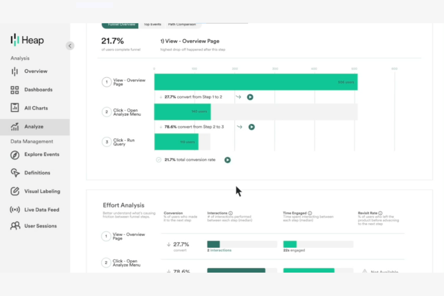
Unlike most analytics platforms, Heap automatically captures every user interaction on your website or app without manual tagging. This makes it especially appealing to ecommerce, product, and UX teams who want to analyze user journeys and identify friction points with minimal setup. If you’re looking for analytics software that reduces tracking gaps and surfaces behavioral insights quickly, Heap offers a unique approach compared to Tableau and other tools.
Why Heap Is a Good Tableau Alternative
What sets Heap apart from Tableau is its ability to automatically capture every user event on your website or app without requiring manual tagging. I picked Heap for teams that want to analyze user behavior in detail without the overhead of configuring each event. Heap’s autocapture feature records clicks, form submissions, and page views out of the box, so you never miss key interactions. This makes it a strong choice for anyone who needs granular behavioral data with minimal setup.
Heap Key Features
Some other features in Heap that analytics teams may find useful include:
- Session Replay: Watch anonymized recordings of user sessions to see exactly how visitors interact with your site or app.
- Retroactive Analysis: Analyze historical data for new events or properties without needing to re-tag or re-implement tracking.
- Data Enrichment: Combine captured event data with user attributes from your CRM or other systems for deeper analysis.
- Journey Maps: Visualize complete user paths across multiple sessions to identify common behaviors and drop-off points.
Heap Integrations
Integrations include LaunchDarkly, Looker Studio, Stripe, Mailchimp, Shopify, Klaviyo, Braze, Marketo, SendGrid, Zapier, JumpCloud, and more.
Pros and Cons
Pros:
- Cloud platform supports behavioral analytics for startups and SaaS companies
- Retroactive analysis allows business users to explore historical data
- Automatic event tracking simplifies data analysis for product teams
Cons:
- Visualization capabilities limited compared to dedicated BI tools
- Pricing models not transparent for growing companies
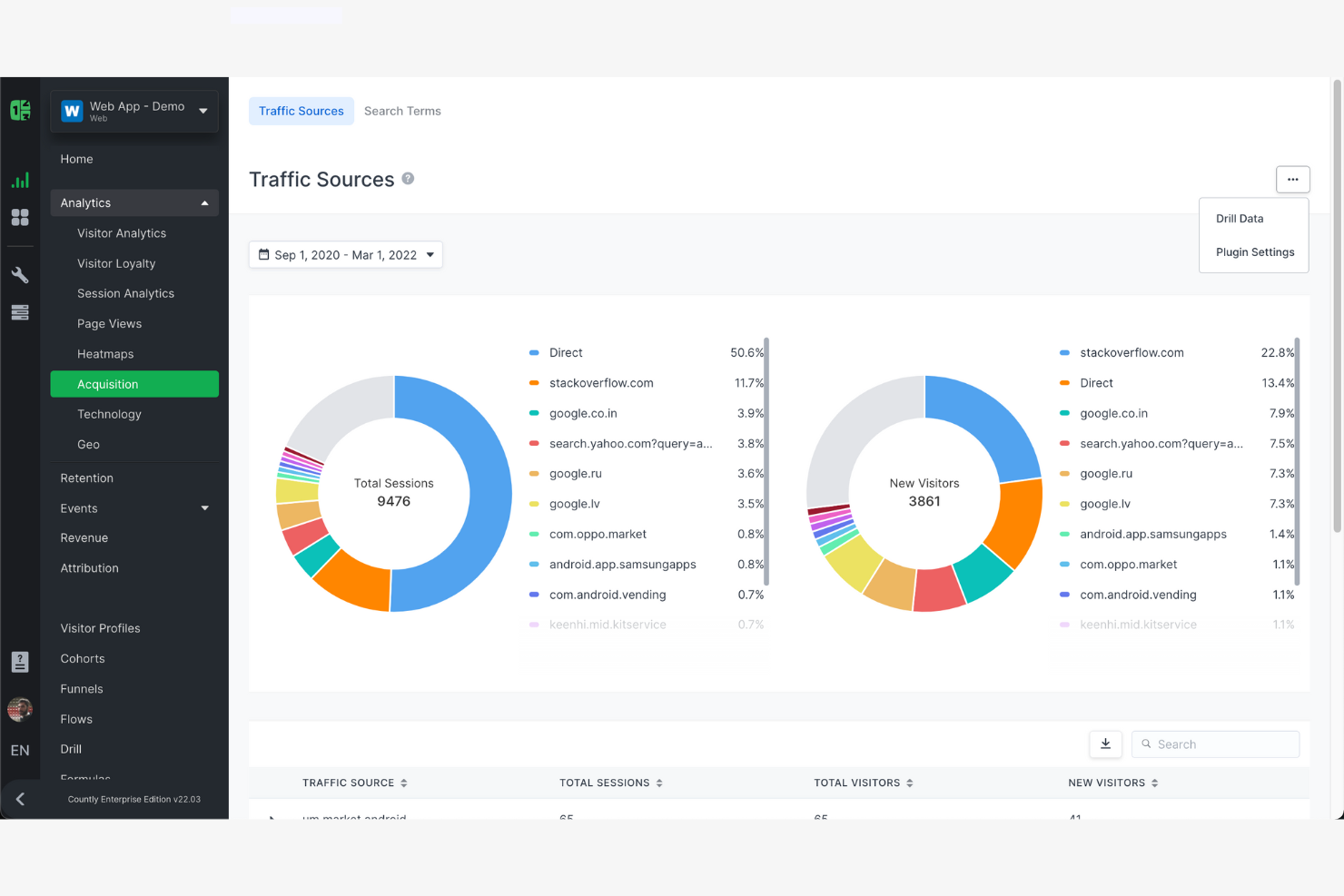
If you need to track user behavior and performance in mobile apps as it happens, Countly is built for you. This platform is designed for product managers, app developers, and digital teams who want real-time insights into mobile app usage and engagement. Unlike Tableau, Countly specializes in mobile analytics, offering event-based tracking and in-app analytics that help you quickly identify trends and issues as users experience them.
Why Countly Is a Good Tableau Alternative
For teams focused on mobile app analytics, Countly offers capabilities that Tableau doesn’t cover natively. I picked Countly because it delivers real-time, event-based tracking that lets you monitor user actions and app performance as they happen. You can set up custom dashboards to visualize in-app events, crashes, and user flows without waiting for batch data processing. Countly’s focus on mobile-specific metrics makes it a strong choice for anyone who needs immediate, actionable insights from their app data.
Countly Key Features
Some other Countly features that analytics buyers may want to know about include:
- User Segmentation: Group users based on behavior, demographics, or custom properties for targeted analysis.
- A/B Testing Module: Run experiments within your app to compare feature performance and user response.
- Push Notification Analytics: Track delivery, open rates, and engagement for in-app push campaigns.
- Data Privacy Controls: Manage user consent and data retention settings to support compliance needs.
Countly Integrations
Integrations include Okta, Elestio, Zapier, Slack, and Salesforce.
Pros and Cons
Pros:
- User segmentation tools for behavioral and engagement insights
- Cloud platform or on-premise deployment for flexible scalability
- Real-time data analysis for mobile apps and digital products
Cons:
- Reporting setup can be time-consuming for complex analytics needs
- Visualization features less advanced than enterprise BI tools
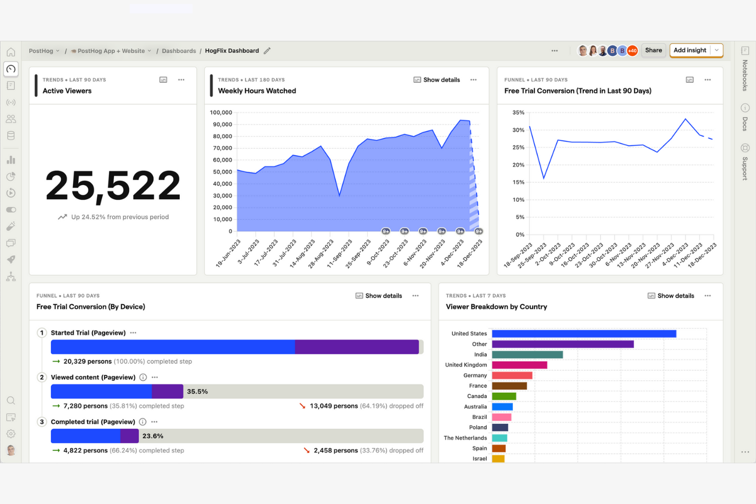
For teams that need full control over their analytics infrastructure, PostHog offers a flexible self-hosted solution. It’s a strong fit for engineering-driven organizations, SaaS companies, and privacy-conscious businesses that want to deploy analytics on their own servers. Unlike Tableau, PostHog combines product analytics, session recording, and feature flagging in a single platform you can run anywhere.
Why PostHog Is a Good Tableau Alternative
If you need analytics software that you can fully control and deploy on your own infrastructure, PostHog stands out from Tableau. I picked PostHog because it offers a self-hosted deployment option, letting you keep sensitive data on-premise or in your private cloud. The platform includes product analytics, session recording, and feature flagging, all managed within your own environment. This flexibility is especially valuable for businesses with strict data privacy requirements or custom infrastructure needs.
PostHog Key Features
Some other PostHog features that analytics buyers may want to know about include:
- Event Autocapture: Automatically collects user interactions like clicks, pageviews, and form submissions without manual tagging.
- Trends Analysis: Visualizes changes in key metrics over time to help spot patterns and anomalies.
- Cohort Analysis: Groups users based on shared behaviors or properties for deeper segmentation.
- Plugin Marketplace: Offers a library of plugins to extend functionality, including integrations and data enrichment tools.
PostHog Integrations
PostHog integrates with GitHub, GitLab, Linear, and Jira.
Pros and Cons
Pros:
- Event-based data analysis with strong behavioral tracking capabilities
- Self-service analytics for startups and engineering-led product teams
- Open-source analytics platform with flexible deployment options
Cons:
- User interface less intuitive for non-technical users
- BI tools and visualization features less advanced than Tableau
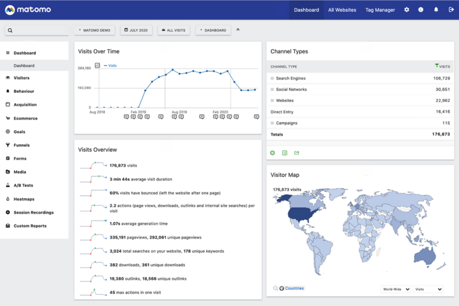
If you need analytics software that puts privacy and data ownership first, Matomo is worth a close look. It’s designed for organizations—especially those in regulated industries or operating in regions with strict privacy laws—who want full control over their analytics data. Unlike Tableau and many other analytics tools, Matomo lets you host data on your own servers and avoid third-party tracking.
Why Matomo Is a Good Tableau Alternative
Matomo stands out from Tableau by giving you full control over your analytics data and user privacy. I picked Matomo for teams that need to comply with strict privacy regulations or want to avoid third-party data sharing. With on-premise hosting and built-in GDPR compliance tools, you can ensure sensitive customer data never leaves your environment. Matomo also offers privacy-focused features like cookieless tracking and customizable data retention, making it a strong choice for privacy-conscious organizations.
Matomo Key Features
Some other features in Matomo that analytics buyers may want to know about include:
- Heatmaps and Session Recordings: Visualize where users click, scroll, and spend time on your site.
- Custom Dashboards: Build personalized dashboards with widgets for the metrics that matter most to your team.
- Ecommerce Analytics: Track product performance, conversion rates, and revenue across your online store.
- Tag Manager: Manage and deploy marketing and analytics tags without editing your site’s code.
Matomo Integrations
Integrations include WordPress, Drupal, Flowpack, Ghost, Shopify, Adobe Commerce, Google Looker Studio, Microsoft Power BI, Slack, Microsoft Teams, and more.
Pros and Cons
Pros:
- Data analysis tools for website traffic, ecommerce, and user behavior
- Cloud platform or self-hosted deployment for flexible scalability
- Privacy-focused analytics platform with full data ownership control
Cons:
- Advanced configuration can be time-consuming for non-technical users
- User interface is less intuitive than modern BI tools
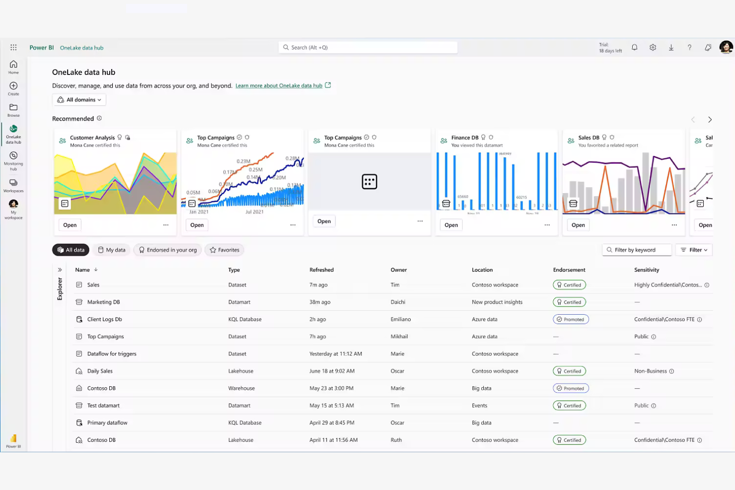
If your business already relies on Microsoft 365, Power BI offers analytics that fit right into your existing workflows. It’s especially useful for organizations that want to connect data from Excel, Teams, and SharePoint without extra setup. As one of the leading self-service BI solutions on the market, Power BI allows business users to explore data, build dashboards, and generate insights without heavy technical support. Unlike Tableau, Power BI’s deep integration with Microsoft tools makes it easy to share dashboards and automate reporting across your company.
Why Microsoft Power BI Is a Good Tableau Alternative
For teams already invested in Microsoft 365, Power BI offers analytics capabilities that work natively with the tools you use every day. I picked Power BI because it connects directly to Excel, Teams, and SharePoint, making it simple to pull in data and collaborate on reports. The platform also supports automated data refreshes and sharing through Microsoft’s secure cloud environment. This level of integration helps your business keep analytics and reporting tightly aligned with daily operations.
Power BI Key Features
Some other Power BI features that analytics buyers may want to know about include:
- Data Modeling Tools: Build complex data models using relationships, calculated columns, and DAX formulas.
- AI-Powered Insights: Use built-in artificial intelligence to detect trends, forecast outcomes, and generate natural language summaries.
- Custom Visual Marketplace: Access a library of custom visuals to enhance your dashboards and reports.
- Row-Level Security: Control data access by defining user-specific permissions within reports.
Power BI Integrations
Integrations include Excel, SharePoint, Microsoft Teams, Azure SQL Database, Dynamics 365, Salesforce, Google Analytics, SAP HANA, Oracle Database, and GitHub.
Pros and Cons
Pros:
- Scalable cloud platform supporting startups through large enterprises
- Self-service analytics with a user-friendly interface for business users
- Business intelligence tools integrated with Microsoft 365 ecosystem
Cons:
- Some advanced features limited to higher pricing models
- DAX modeling introduces a steep learning curve for new users
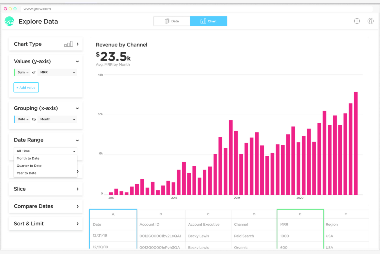
If your team needs dashboards that match your exact business metrics, Grow gives you full control over how you visualize and organize your data. It’s a strong fit for retail and ecommerce teams that want to blend data from multiple sources and design dashboards tailored to their KPIs. Unlike Tableau, Grow emphasizes no-code customization and flexible dashboard layouts, so you can adapt analytics to your unique workflows.
Why Grow Is a Good Tableau Alternative
What sets Grow apart as a Tableau alternative is its focus on customizable dashboard creation for teams that want analytics tailored to their business. I like that Grow lets you build dashboards from scratch using a drag-and-drop editor, so you can arrange charts, tables, and visualizations exactly how you want. The platform also supports custom calculations and metrics, allowing you to define KPIs that matter most to your business. This flexibility makes Grow a strong choice if you need dashboards that adapt to your unique reporting needs.
Grow Key Features
Some other Grow features that analytics buyers may want to know about include:
- Data Blending: Combine data from multiple sources into a single dashboard view.
- Scheduled Email Reports: Send automated dashboard snapshots to team members on a set schedule.
- Pre-Built Data Connectors: Connect quickly to popular data sources like Shopify, Salesforce, and Google Analytics.
- User Permissions Management: Set different access levels for users to control who can view or edit dashboards.
Grow Integrations
Integrations include Salesforce, Google Analytics, Shopify, HubSpot, QuickBooks, Stripe, Google Sheets, and MySQL.
Pros and Cons
Pros:
- Quick setup reduces time-consuming reporting development
- Self-service analytics tools for small businesses and startups
- Intuitive interface designed for non-technical users building dashboards
Cons:
- Limited advanced features compared to enterprise BI tools
- Pricing models not fully transparent without sales contact
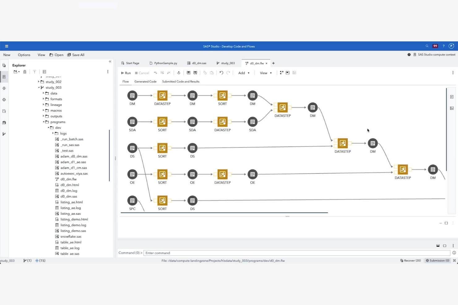
SAS offers advanced analytics and statistical modeling capabilities for teams that need more than basic data visualization. It’s a strong fit for data scientists and analysts in industries like retail, finance, and healthcare who require deep statistical analysis and predictive modeling. SAS stands out from Tableau by providing a broader range of statistical techniques and machine learning tools for complex data challenges.
Why SAS Is a Good Tableau Alternative
SAS stands out for its advanced statistical modeling capabilities, which go far beyond the visualization focus of Tableau. I picked SAS for teams that need tools like regression analysis, time series forecasting, and machine learning algorithms built into their analytics platform. The software supports complex data manipulation and offers a wide range of statistical procedures for in-depth analysis. If your business relies on predictive analytics or custom statistical models, SAS provides the specialized features you need.
SAS Key Features
Some other features in SAS that analytics teams may find useful include:
- Data Preparation Tools: Clean, transform, and merge large datasets using built-in data management functions.
- Interactive Dashboards: Build and customize dashboards to visualize key metrics and share insights with stakeholders.
- Automated Reporting: Schedule and distribute recurring reports to keep teams updated without manual intervention.
- Collaboration Workspaces: Work together on analytics projects with shared environments and version control.
SAS Integrations
Integrations include Salesforce, Microsoft Dynamics 365, SAP, Oracle, Hadoop, Teradata, Snowflake, Amazon Redshift, and Google BigQuery.
Pros and Cons
Pros:
- Strong fit for business intelligence teams with compliance and controls
- Scalability for complex datasets and governed analytics programs
- Advanced data analysis with statistical modeling for large enterprises
Cons:
- Pricing models are typically costly for small businesses and startups
- Steep learning curve for non-technical users
Other Tableau Alternatives
Here are some additional Tableau alternative options that didn’t make it onto my shortlist, but are still worth checking out:
- Amplitude
For behavioral funnel insights
- Paylocity
For workforce analytics integration
- Domo
For cloud-based data integration
- Amazon QuickSight
For serverless BI with pay-as-you-go pricing and built-in ML insights
- Qlik Sense
For associative data exploration
- Metabase
For open-source BI with simple self-service analytics for non-technical teams
- Looker Studio
For free cloud reporting and dashboards connected to Google data sources


Tableau Alternatives Selection Criteria
When selecting the best Tableau alternatives to include in this list, I considered common buyer needs and pain points related to analytics software products, like embedding analytics into existing workflows and supporting complex data modeling. I also used the following framework to keep my evaluation structured and fair:
Core Functionality (25% of total score)
To be considered for inclusion in this list, each solution had to fulfill these common use cases:
- Connect to multiple data sources
- Visualize data with charts and dashboards
- Filter and drill down into data
- Export and share reports
- Schedule automated data refreshes
Additional Standout Features (25% of total score)
To help further narrow down the competition, I also looked for unique features, such as:
- Embedded analytics capabilities
- AI-powered insights and recommendations
- White-labeling and branding options
- Advanced data modeling tools
- Real-time data processing
Usability (10% of total score)
To get a sense of the usability of each system, I considered the following:
- Clean and intuitive user interface
- Customizable dashboard layouts
- Responsive design for mobile and desktop
- Accessibility features for all users
- Minimal clicks to complete common tasks
Onboarding (10% of total score)
To evaluate the onboarding experience for each platform, I considered the following:
- Step-by-step product tours
- Availability of training videos and documentation
- Pre-built dashboard templates
- Access to onboarding webinars or workshops
- In-app chatbots for real-time help
Customer Support (10% of total score)
To assess each software provider’s customer support services, I considered the following:
- 24/7 support availability
- Multiple support channels (chat, email, phone)
- Access to a knowledge base or help center
- Community forums for peer support
- Fast response times to inquiries
Value For Money (10% of total score)
To evaluate the value for money of each platform, I considered the following:
- Transparent and flexible pricing plans
- Free trial or demo availability
- Features included at each pricing tier
- No hidden fees or surprise charges
- Discounts for annual or volume commitments
Customer Reviews (10% of total score)
To get a sense of overall customer satisfaction, I considered the following when reading customer reviews:
- Consistent positive feedback on core features
- Reports of reliable performance and uptime
- Feedback on customer support experiences
- User comments on integration capabilities
- Overall value and satisfaction ratings
Why Look For a Tableau Alternative?
While Tableau is a good choice of analytics software, there are a number of reasons why some users seek out alternative solutions. You might be looking for a Tableau alternative because…
- You need to embed analytics directly into your own applications
- Your team requires more advanced data modeling capabilities
- You want more transparent or flexible pricing options
- You need better support for real-time or streaming data
- Your organization needs white-labeling or custom branding features
If any of these sound like you, you’ve come to the right place. My list contains several analytics software options that are better suited for teams facing these challenges with Tableau and looking for alternative solutions.
Tableau Key Features
Here are some of the key features of Tableau, to help you contrast and compare what alternative solutions offer:
- Drag-and-drop dashboard and report builder
- Wide range of data visualization options
- Live and scheduled data connection support
- Interactive filtering and drill-down capabilities
- Built-in data preparation and cleaning tools
- Collaboration and sharing features for teams
- Mobile-optimized dashboards and reports
- Integration with Salesforce and other major platforms
- Advanced analytics with calculated fields and forecasting
- Role-based access controls for data security
What’s Next:
If you're in the process of researching Tableau alternatives, connect with a SoftwareSelect advisor for free recommendations.
You fill out a form and have a quick chat where they get into the specifics of your needs. Then you'll get a shortlist of software to review. They'll even support you through the entire buying process, including price negotiations.